Olivia
PAINT, CHARCOAL, INK | NEW YORK
OLIVIAHATZ7@GMAIL.COM
01
RED AND OCHRE
Materials: Oil paint on canvas
Dimensions: 24 inches by 18 inches
Year Completed: 2025
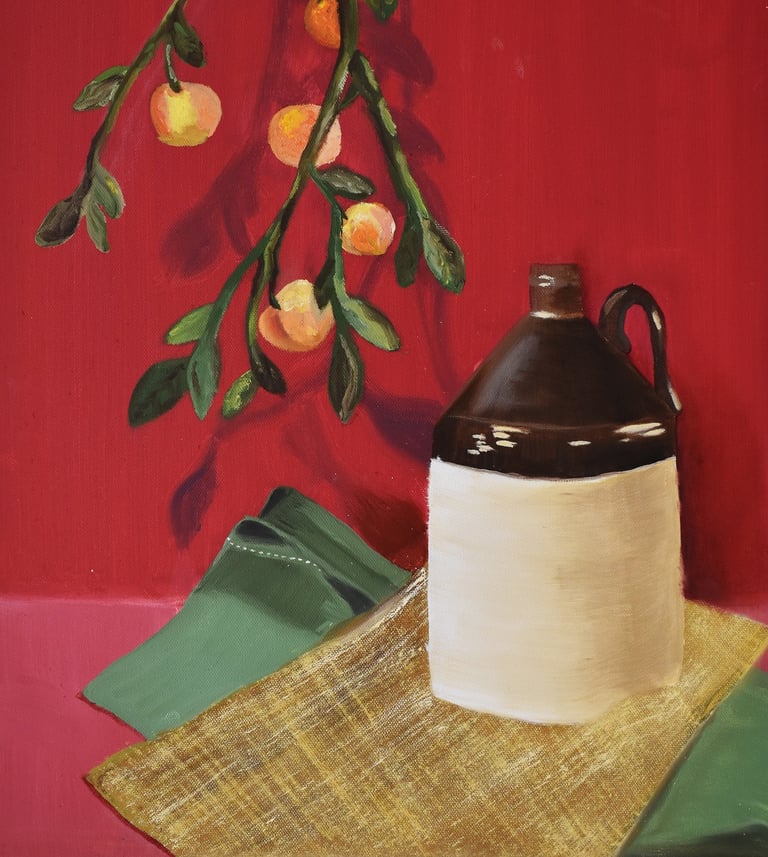
This still life explores the contrast begin organic forms - the fruit on the vine - and the structured composition of the jug. The deep red background creates a sense of intensity and warmth, allowing the earthy tones of the jug and the fruit to stand out.
I used oil paint to layer the light and texture, specifically in the fabric and reflections on the jug. The hanging branch with fruit adds softness and a sense of motion.
02
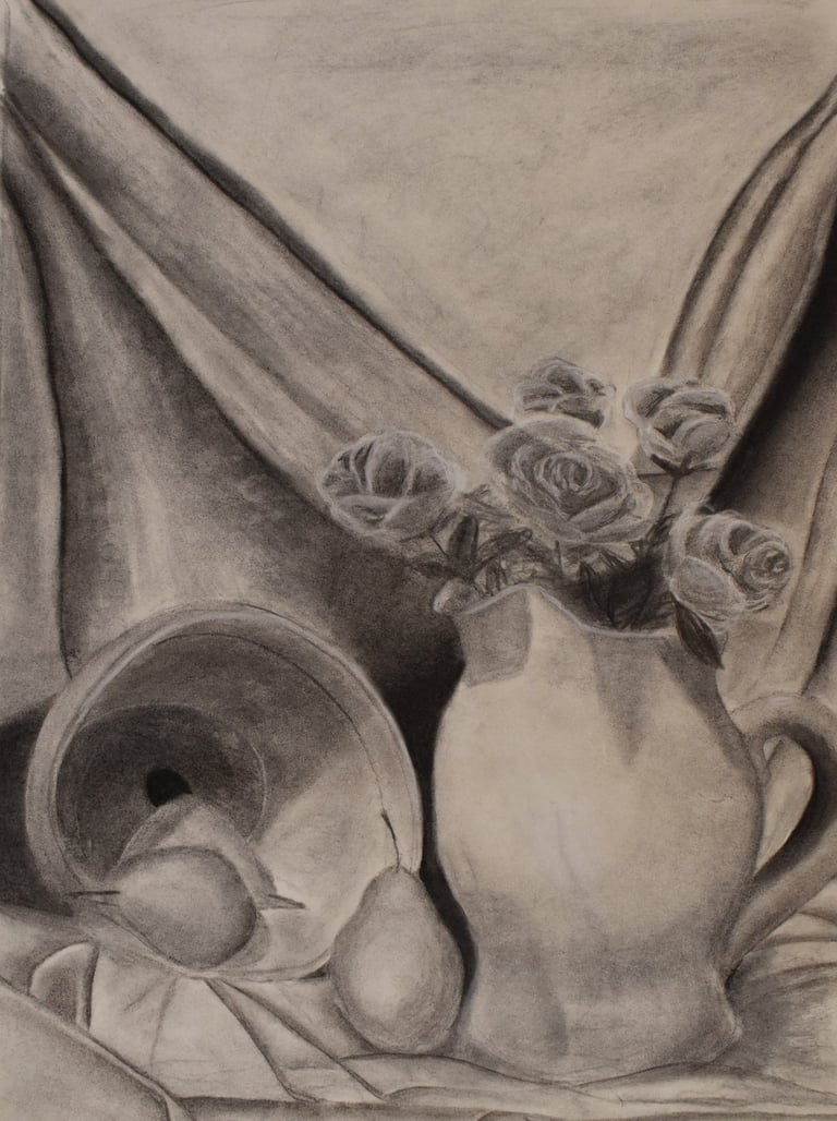
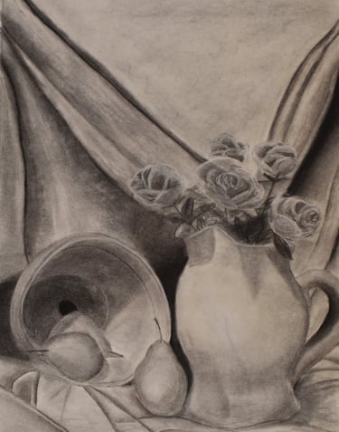
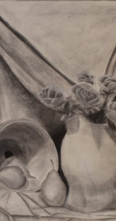
ROSES AND PEARS
Materials: Charcoal on Paper
Dimensions: 24 inches by 18 inches
Year Completed: 2025
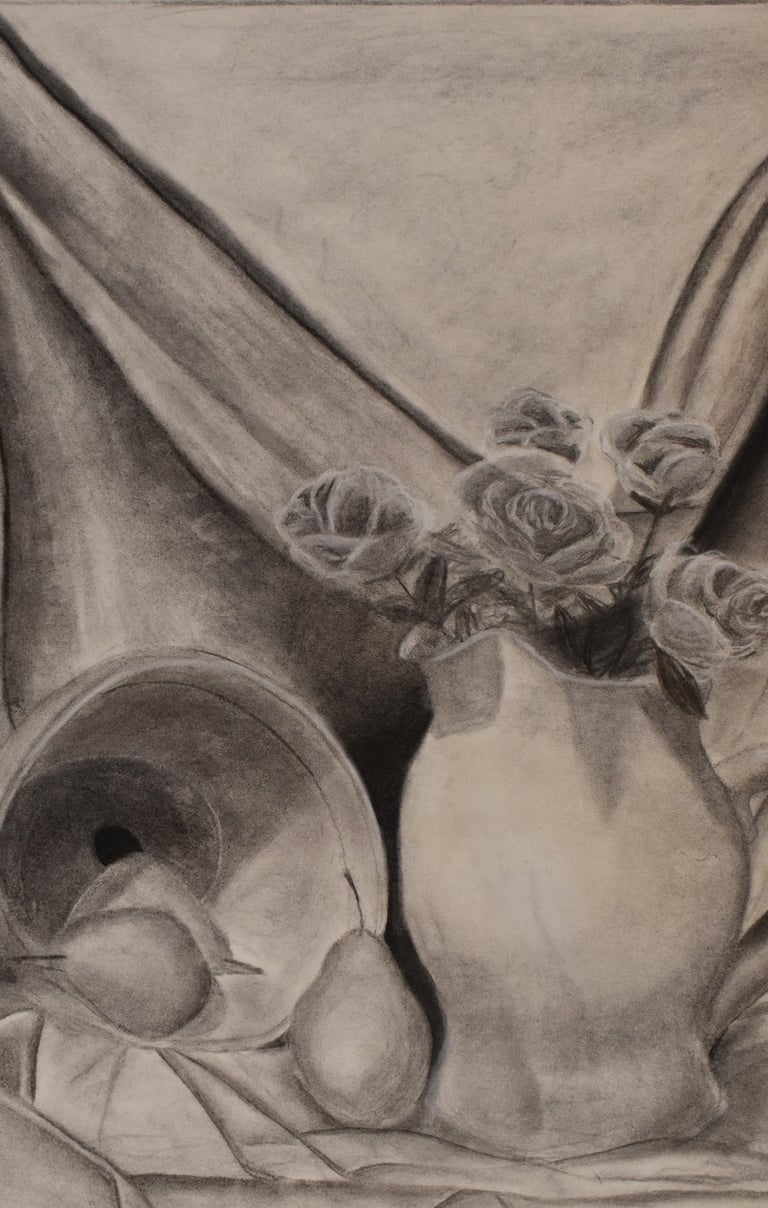
This still life drawing uses textures, highlights, and blending techniques to explore value and form by using varying gradations of charcoal. The illustration of depth is created by applying different pressures of charcoal to make shadows behind objects. Highlights in the foreground were created by applying lighter pressure and erasure.
I focused on how light interacts with the soft drapery, reflective surfaces, and organic shapes (the roses and the pears) to create a unified composition. The delicate roses contrast with the heavy pitcher, showing both the fragility and stability. Inspired by Giorgio Morandi's simple still life, I used controlled shading to create a sense of calm and timelessness.
03
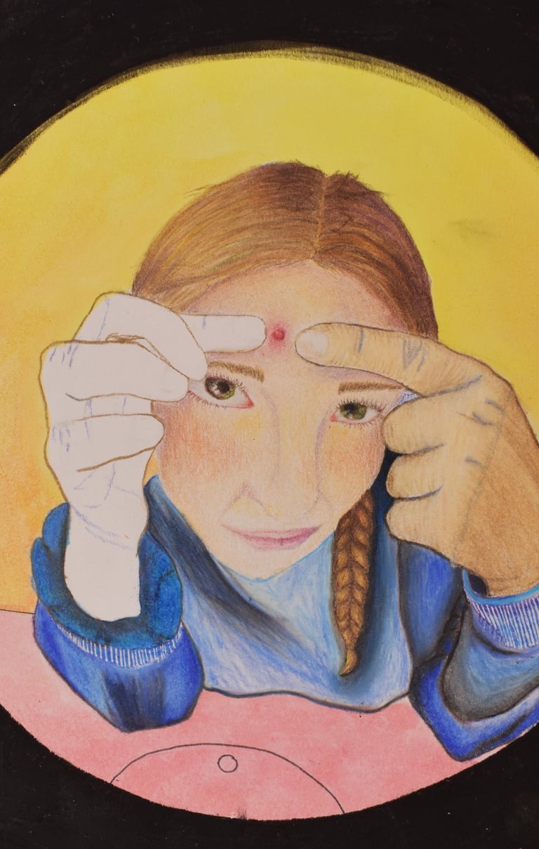
UNDER MY SKIN
Materials: Colored pencil, watercolor,
crayon, oil pastel and pen
on board
Dimensions: 12 inches by 9 inches
Year Completed: 2025
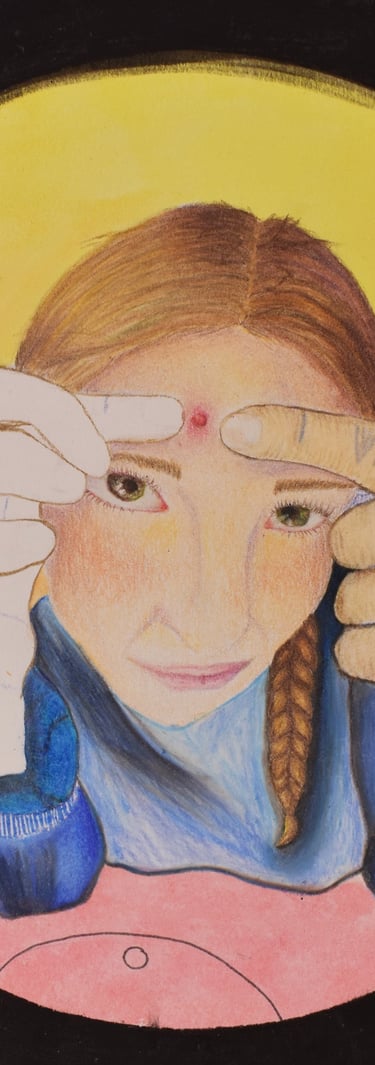
Influenced by my own experiences, this self-portrait combines realism and emotional distortion to explore vulnerability and self-awareness through an intimate, uncomfortable moment. It shows the struggle between control and imperfection. It shows the struggle between control and imperfection.
I began by taking a photo of myself using a fisheye lens to distort and exaggerate the focal point. The circular framing represents the confinement of both the mirror and the mind. One hand remains uncolored, intentionally unfinished, symbolizing incompleteness and the parts of oneself that have yet to develop. Using colored pencil allowed for detailed layering of skin tones and textures, contrasting the softness of the face with the tension in the hands. My goal was to portray both the humor and unease that come with self-scrutiny and growing up.

04
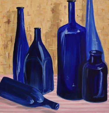
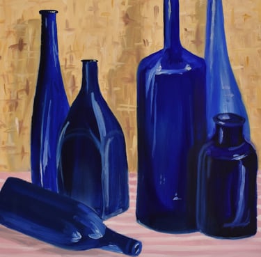
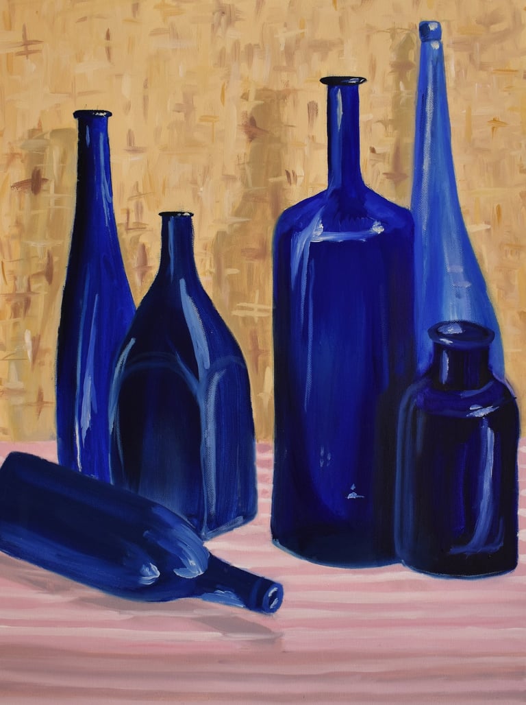
BOTTLES OF BLUE
Materials: Oil paint on canvas
Dimensions: 24 inches by 18 inches
Year Completed: 2024
The cobalt blue glass bottles in this still life painting focus on how the bottles are both transparent and reflective. The subtle variations of tone are the result of using an intentionally limited color palette, exploring how light passes through glass and interacts with form, creating depth and unity within the composition. The warm background contrasts with the cool, luminous surfaces of the bottles, emphasizing their structure and shadows.
05


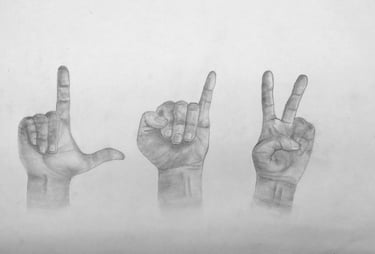
IN MY HANDS
Materials: Graphite pencil on paper
Dimensions: 12 inches by 18 inches
Year Completed: 2024
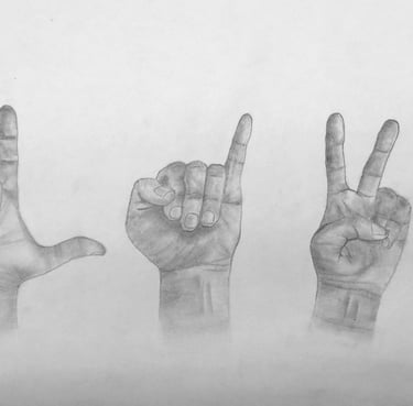
This simple piece depicts three hands spelling out my nickname in American Sign Language (ASL), inspired by my time volunteering with non-verbal children at the Center for Developmental Disabilities. In this piece, I learned about basic shapes, proportions, gestures, and the physical representation and significance of hands.
The goal was to learn how to create a more realistic anatomical figure of the hand. While this began as a study in anatomy and shading, it evolved into an exploration of self-expression beyond words. Using ASL shows how identity can be expressed through movement and form.


06
PRIMARY FABRICS
Materials: Pastel on paper
Dimensions: 25 inches by 19 inches
Year Completed: 2024
When prompted to create a still life, I wanted to focus on exploring how light, shadow, and color all interact using drapery and pastel. I began by taking my own reference photo, and then digitally photoshopping the natural fabric colors. I changed the original purple, green, and yellow fabric colors to bold primary hues so I could focus on contrast and emphasize the relationship between color and depth.
This still life was inspired by the bold, colorful work of Henri Matisse - taking an everyday item - fabric to create a bright and expressive piece. By using color and form, this piece demonstrates that there is beauty in simplicity.
Impressed?
Let us cross paths - reach out and we’ll work on your next project together.
